
| Sv translation | |||||||||||||||||||||||||||||||||||||||||||||||||||||||||||||||||||||||||||||||||||||||||||||||||||||||||||||||||||||||||||||||||||||||||||||||||||||||||||||||||||||||||||||||||||||||||||||||||||||||||||||||||||||||||||||||||||||||||||||||||||||||||||||||||||||||||||||||||||||||||||||||||||||||||||||||||||||||||||||||||||||||||||||||||||||||||||||||||||||||||||||||||||||||||||||||||||||||||||||||||||||||||||||||||
|---|---|---|---|---|---|---|---|---|---|---|---|---|---|---|---|---|---|---|---|---|---|---|---|---|---|---|---|---|---|---|---|---|---|---|---|---|---|---|---|---|---|---|---|---|---|---|---|---|---|---|---|---|---|---|---|---|---|---|---|---|---|---|---|---|---|---|---|---|---|---|---|---|---|---|---|---|---|---|---|---|---|---|---|---|---|---|---|---|---|---|---|---|---|---|---|---|---|---|---|---|---|---|---|---|---|---|---|---|---|---|---|---|---|---|---|---|---|---|---|---|---|---|---|---|---|---|---|---|---|---|---|---|---|---|---|---|---|---|---|---|---|---|---|---|---|---|---|---|---|---|---|---|---|---|---|---|---|---|---|---|---|---|---|---|---|---|---|---|---|---|---|---|---|---|---|---|---|---|---|---|---|---|---|---|---|---|---|---|---|---|---|---|---|---|---|---|---|---|---|---|---|---|---|---|---|---|---|---|---|---|---|---|---|---|---|---|---|---|---|---|---|---|---|---|---|---|---|---|---|---|---|---|---|---|---|---|---|---|---|---|---|---|---|---|---|---|---|---|---|---|---|---|---|---|---|---|---|---|---|---|---|---|---|---|---|---|---|---|---|---|---|---|---|---|---|---|---|---|---|---|---|---|---|---|---|---|---|---|---|---|---|---|---|---|---|---|---|---|---|---|---|---|---|---|---|---|---|---|---|---|---|---|---|---|---|---|---|---|---|---|---|---|---|---|---|---|---|---|---|---|---|---|---|---|---|---|---|---|---|---|---|---|---|---|---|---|---|---|---|---|---|---|---|---|---|---|---|---|---|---|---|---|---|---|---|---|---|---|---|---|---|---|---|---|---|---|---|---|---|---|---|---|---|---|---|---|---|---|---|---|---|---|---|---|---|---|---|---|---|---|---|---|---|---|---|---|---|---|---|---|---|---|---|---|---|---|---|
| |||||||||||||||||||||||||||||||||||||||||||||||||||||||||||||||||||||||||||||||||||||||||||||||||||||||||||||||||||||||||||||||||||||||||||||||||||||||||||||||||||||||||||||||||||||||||||||||||||||||||||||||||||||||||||||||||||||||||||||||||||||||||||||||||||||||||||||||||||||||||||||||||||||||||||||||||||||||||||||||||||||||||||||||||||||||||||||||||||||||||||||||||||||||||||||||||||||||||||||||||||||||||||||||||
| |||||||||||||||||||||||||||||||||||||||||||||||||||||||||||||||||||||||||||||||||||||||||||||||||||||||||||||||||||||||||||||||||||||||||||||||||||||||||||||||||||||||||||||||||||||||||||||||||||||||||||||||||||||||||||||||||||||||||||||||||||||||||||||||||||||||||||||||||||||||||||||||||||||||||||||||||||||||||||||||||||||||||||||||||||||||||||||||||||||||||||||||||||||||||||||||||||||||||||||||||||||||||||||||||

| Anker | ||||
|---|---|---|---|---|
|
Mit Hilfe von Kennzahlen werden Verbrauch, Wirtschafts- oder Stückzahlen vergleichbar gemacht. Mit der KPI-Funktion bilden Sie auf Ihr Unternehmen zugeschnittene Kennzahlen und bewerten diese mit Ihrem eigenen Bewertungssystem. Alle Kennzahlen können als KPI-Widgets in Dashboards verwendet werden. Das KPI-Widget kann als Chart, als Tabelle oder kombiniert im Dashboard abgebildet werden.
Im Chart erfassen Sie auf einen Blick die Kennzahlen und ihre Operanden. Anhand der Operanden erkennen Sie die Ursachen für verbesserte oder verschlechterte Kennzahlen und deren Tendenz, woraus Gründe der Veränderung abgeleitet und Bewertungen vorgenommen werden können.
Mit der KPI-Funktion, bestehend aus den 3 Bereichen KPI-Manager, KPI-Konfigurator und KPI-Widget (Chart und Tabelle) stellen Sie Ihre Kennzahlen strukturiert und übersichtlich dar.
| KPI-Manager |
|
| KPI-Konfigurator | Erstellung individueller KPIs. |
| KPI-Widget | Kann in Dashboards integriert werden. |
Berechnung:
Kennzahlen werden immer für ein ausgewählten Zeitraum gebildet. Die Kennzahl wird aus dem arithmetischen Mittel einer Zeiteinheit gebildet.
Beispiel Zeitraum letzes Jahr:
| Monat | 1 | 2 | 3 | 4 | 5 | 6 | 7 | 8 | 9 | 10 | 11 | 12 | Monate = 12 |
| Kennzahl | 10 | 10 | 10 | 15 | 15 | 15 | 20 | 20 | 20 | 25 | 25 | 25 | Summe = 210 |
| Die Kennzahl des Jahres ergibt sich aus der Division von Anzahl der Monate und Summe der Kennzahlen: 210 / 12 = 17,5 (Kennzahl des Jahres) | |||||||||||||
![]() Hinweis:
Hinweis:
Über eine manuelle Eingabe in der GridVis-Desktop-Installation konfigurieren Sie Eingabeparameter, wie Umsatzzahlen, Stückzahlen, Flächen, Mitarbeiterzahlen und Andere.
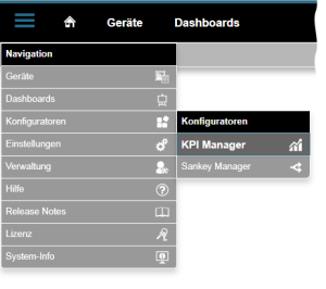
Wie öffne ich die KPI-Funktion?
- Klicken Sie in der Navigationsleiste auf die Schaltfläche Navigation
 .
. - Den KPI-Manager
 erreichen Sie Im Ausklapp-Menü unter Konfiguratoren
  .
.
Bereich KPI-Manager (Übersichtsfenster):
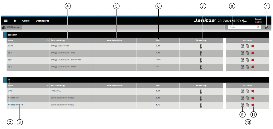
| Pos. | Icon | Kurztext | Beschreibung |
|---|---|---|---|
| 1 | erstellen | Neue Kennzahl (KPI) erstellen. | |
| 2 | Gruppe | Kennzahlen-Gruppe (KPI-Gruppe), im KPI-Konfigurator konfigurierbar. | |
| 3 | Name | Name der Kennzahl (KPI).
| |
| 4 | Beschreibung | Beschreibung der Kennzahl (im KPI-Konfigurator konfigurierbar). | |
| 5 | Verantwortlicher | Kennzahl-Verantwortlicher.
| |
| 6 | Wert | Kennzahlen-Wert, abhängig von der Einstellung Zeitraum.
| |
| 7 | Bewertung | 3-stufige Bewertung (Ampel), abhängig von Kennzahl und deren Zeitraum.
| |
| 8 | suchen | KPI suchen und filtern. | |
| 9 | öffnen | KPI-Konfigurator öffnen. | |
| 10 | kopieren | KPI kopieren | |
| 11 | löschen | KPI löschen. |
Der KPI-KonfiguratorAnker kpikonfigurator kpikonfigurator
Besteht aus den Bereichen Einstellungen, Bewertung und Trend und Vorschau. Den KPI-Konfigurator öffnen Sie über Pos. 9 ![]() des KPI-Managers (siehe unter Der KPI-Manager).
des KPI-Managers (siehe unter Der KPI-Manager).
Der KPI-Konfigurator
- dient zur Bildung und Konfiguration von Kennzahlen.
- dient zur Bewertung und Trend-Einstellung.
- bietet eine Vorschau über eingestellte Charts und Tabellen

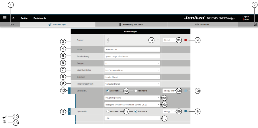
Einstellungen
| Pos. | Icon | Kurztext | Beschreibung |
|---|---|---|---|
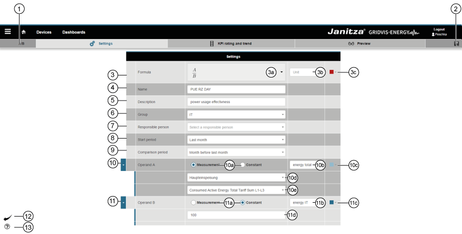
| 1 | Formel | Anzeige der unter Pos. 3a gewählten Formel. | |
| 2 | Speichern | Vorgenommene Einstellungen speichern. | |
| 3 | Formel | Formel für die Kennzahlbildung | |
| 3a | Auswahlliste Formeln | Auswahlliste der verfügbaren Formeln:
| |
| 3b | Einheit | Optionales Eingabefeld der Einheit zur Achsenbeschriftung des KPI-Graphen. | |
| 3c | Farbfeld | Farbauswahl für den KPI-Graph. | |
| 4 | Name | Eingabefeld: Name der Kennzahl (KPI). | |
| 5 | Beschreibung | Eingabefeld: Beschreibung der Kennzahl (KPI). | |
| 6 | Gruppe | Auswahlfeld: Zusatzinformationen zur Kennzahl (KPI). Der Eintrag erscheint im KPI-Manager (siehe Pos. 2 in der Beschreibung Der KPI-Manager). | |
| 7 | Verantwortlicher | Auswahlfeld: Optionale Eingabe eines Verantwortlichen. | |
| 8 | Zeitraum | Auswahlliste: Ausgewählter Zeitraum für den das System die Kennzahl bildet (siehe auch unter Der KPI-Manager - Pos. 6 Wert). Graphen und Tabellen zeigen die Auswertung eine Zeiteinheit tiefer.
| |
| 9 | Vergleichszeitraum | Auswahlliste: Ausgewählter Vergleichszeitraum, der mit dem unter Pos. 8 gewählten Zeitraum verglichen wird. | |
| 10 | Operand A | Operand als Messwert. | |
| 10a | Radio buttons: Operand A als Messwert oder Konstante wählbar. | ||
| 10b | Eingabefeld: Bezeichnung des Operanden A. | ||
| 10c | Farbauswahl für den Graph (Bargraph).
| ||
| 10d | Auswahlfeld: Auswahl des Messgeräts. | ||
| 10e | Auswahlfeld: Auswahl des Messwertes. | ||
| 11 | Operand B | Operand als Konstante. | |
| 11a | Radio buttons: Operand B als Messwert oder Konstante wählbar. | ||
| 11b | Eingabefeld: Bezeichnung des Operanden B. | ||
| 11c | Farbauswahl für den Graph (Bargraph).
| ||
| 11d | Eingabefeld: Nummerische Eingabe der Konstante! | ||
| 12 | Schaltfläche Zurück | Ein Klick auf die Schaltfläche, führt zurück zum KPI-Manager | |
| 13 | Schaltfläche Hilfe |
|
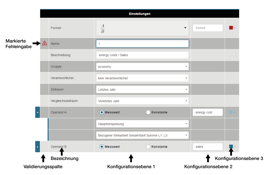
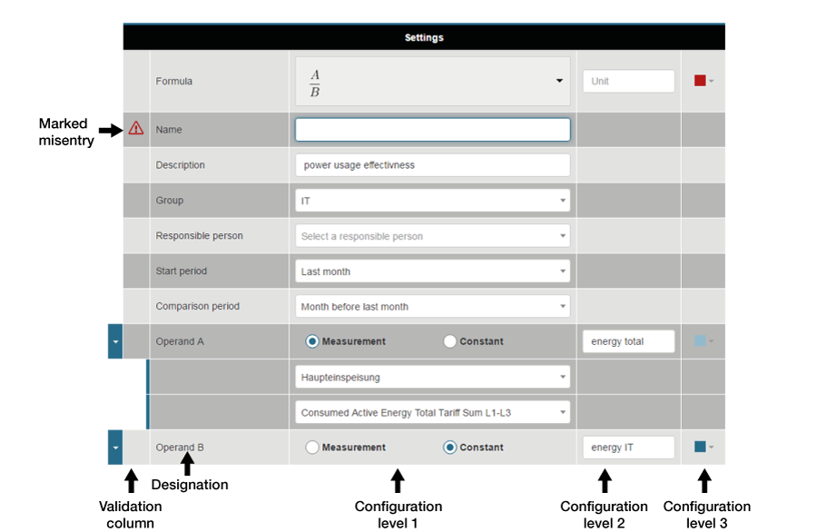
Eingabe-Validierung
Das System
Prüft mit der Eingabe-Validierung, ob im Fenster Einstellungen alle Einträge korrekt gemacht wurden.
Ein rotes Warndreieck in der Validierungsspalte (1. Spalte) kennzeichnet leere Eingabefelder oder fehlerhafte Eingaben.
![]() Hinweis:
Hinweis:
Wenn Sie mit der Maus über dem roten Warndreieck halten, bekommen Sie einen Tooltip (Information) zum Validierungsfehler!
Bewertung und TrendAnker kpibewertung kpibewertung
Kennzahlen können mit einer 3-stufigen Ampel bewertet werden. Das Ergebnis wird in tabellenform in der Vorschau angezeigt.
Kennzahlen werden über einen Zeitraum gebildet. Die Bewertung der Kennzahlen bezieht sich auf diesen Zeitraum oder auch eine Zeiteinheit tiefer.
![]() Hinweis:
Hinweis:
Die Bewertung von Kennzahlen
- erfolgt als gut, neutral oder schlecht.
- erfolgt in 2 Richtungen, das heißt Sie können eine hohe Kennzahl als gut oder schlecht bewerten.
- lässt sich sehr gut mit Ampeln visualisieren. Hierbei stehen grüne Ampeln für gute Kennzahlen, gelbe Ampeln für neutrale Kennzahlen und rote Ampeln für schlechte Kennzahlen.
(Eine neutrale Ampel - Ampel ohne Farbe zeigt, die Kennzahlen liegen außerhalb des definierten Bewertungsbereichs).
| Pos. | Icon | Kurztext | Beschreibung |
|---|---|---|---|
| 1 | Speichern | Vorgenommene Einstellungen speichern. | |
| 2a | Bewertungsstufe 1 * | Eingabefelder: Den für gut bewerteten Bereich eintragen. | |
| 2b | Bewertungsstufe 2 | Eingabefelder: Den für neutral bewerteten Bereich eintragen. | |
| 2c | Bewertungsstufe 3 * | Eingabefelder: Den für schlecht bewerteten Bereich eintragen. | |
| 3 | Trend-Anzeige |
| |
| 4a | Stark steigender Trend ** | Relative Eingabe (in %) bezogen auf die Veränderung der Kennzahl - 4-stufige Anzeige realisierbar. | |
| Leicht steigender Trend | |||
| 4b | Stark fallender Trend ** | ||
| Leicht fallender Trend | |||
| 5 | Schaltfläche Zurück | Ein Klick auf die Schaltfläche, führt zurück zum KPI-Manager. | |
| 6 | Schaltfläche Hilfe |
| |
*... Die Bereichswerte (Kennzahlen) für Bewertungsstufe 1 können größer sein, als die Bereichswerte der Bewertungsstufe 3 und umgekeht. Das heißt, Sie können hohe Bereichswerte (Kennzahlen) gut oder schlecht bewerten. **... Icons zeigen den Trend. Das System erkennt den Trend durch die eingegebenen Bereichswerte. | |||
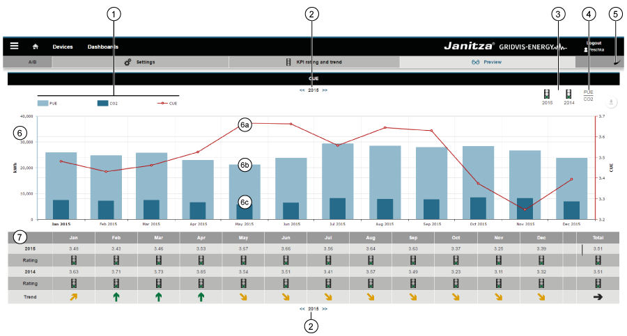
Die Vorschau-FunktionAnker kpivorschau kpivorschau
Mit Klick auf die Schaltfläche Vorschau in der Unternavigation erscheint eine Vorschau Ihres KPI-Graphen und der KPI-Tabelle.
![]() Hinweis:
Hinweis:
Der KPI-Graph und die KPI-Tabelle können auch als Widget auf Dashboards platziert werden.
Der Graph zeigt die
- Kennlinie als Linie (Grundeinstellung rot).
- Operanden A und B als Balken dargestellt.
- Operanden C und D (falls vorhanden) ebenfalls als Linie.
| Tipp |
|---|
Eine steigende oder sinkende Kennzahl (Linie) gibt durch die Balkenanzeige Aufschluss über die Ursache der Veränderung. |
Die Tabelle zeigt
- den nummerischen Wert der Kennzahl.
- eine Bewertung und den Trend der Kennzahl
| Pos. | Icon | Kurztext | Beschreibung |
|---|---|---|---|
| 1 | Legende | Zeigt Farben und Bezeichnungen der Kennzahlen und Operanden. | |
| 2 | Zeitnavigation | Zeitraum Navigation zur KPI-Graphen und -Tabellen Darstellung. | |
| 3 |
| Bewertungsanzeige | Zeigt die Bewertung des ausgewählten Zeitraums und des Vergleichszeitraumes (vgl. Pos. 2 Bewertung und Trend). |
| 4 | Formel-Anzeige | Zeigt die mit der Kennzahl gebildeten Formel (vgl. Pos. 3 Der KPI-Konfigurator - Einstellungen). | |
| 5 | Schaltfläche Zurück | Ein Klick auf die Schaltfläche, führt zurück zum KPI-Manager. | |
| 6 | KPI-Graph | ||
| 6a | Kennzahl | ||
| 6b | Operand A | (vgl. Pos. 10 Der KPI-Konfigurator - Einstellungen). | |
| 6c | Operand B | (vgl. Pos. 11 Der KPI-Konfigurator - Einstellungen). | |
| 7 | KPI-Tabelle |
Das KPI-WidgetAnker kpiwidget kpiwidget
Erstellte KPIs können als KPI-Widget auf vorhandene oder neue Dashboards platziert werden.
Im Fenster Dasboards kann Ihr KPI
- über den Namen ausgewählt werden.
- auf dem Dashboard als KPI-Graph oder KPI-Tabelle frei positioniert und skaliert werden.
 Hinweis: Vorteilhaft und nützlich ist eine Darstellung als KPI-Chart (KPI-Graph und -Tabelle untereinander positioniert. Vgl. Bild Die Vorschau-Funktion).
| Pos. | Icon | Kurztext | Beschreibung |
|---|---|---|---|
| 1 | Visualisierung auswählen | Auswahlliste der Visualisierung: Widget Kennzahl (KPI) wählen! | |
| 2 | Wählen Sie ein KPI | Auswahlliste aller KPIs. | |
| 3 | Ansichtsmodus | Auswahlliste: KPI-Graph oder KPI-Tabelle. | |
| 4 | Kopfzeile | Schieberegler zum ein- und ausblenden der Kopfzeile. |
| Sv translation | ||||||||||||||||||||||||||||||||||||||||||||||||||||||||||||||||||||||||||||||||||||||||||||||||||||||||||||||||||||||||||||||||||||||||||||||||||||||||||||||||||||||||||||||||||||||||||||||||||||||||||||||||||||||||||||||||||||||||||||||||||||||||||||||||||||||||||||||||||||||||||||||||||||||||||||||||||||||||||||||||||||||||||||||||||||||||||||||||||||||||||||||||||||||||||||||||||||||||||||||||||||||||||||||||||||||||||
|---|---|---|---|---|---|---|---|---|---|---|---|---|---|---|---|---|---|---|---|---|---|---|---|---|---|---|---|---|---|---|---|---|---|---|---|---|---|---|---|---|---|---|---|---|---|---|---|---|---|---|---|---|---|---|---|---|---|---|---|---|---|---|---|---|---|---|---|---|---|---|---|---|---|---|---|---|---|---|---|---|---|---|---|---|---|---|---|---|---|---|---|---|---|---|---|---|---|---|---|---|---|---|---|---|---|---|---|---|---|---|---|---|---|---|---|---|---|---|---|---|---|---|---|---|---|---|---|---|---|---|---|---|---|---|---|---|---|---|---|---|---|---|---|---|---|---|---|---|---|---|---|---|---|---|---|---|---|---|---|---|---|---|---|---|---|---|---|---|---|---|---|---|---|---|---|---|---|---|---|---|---|---|---|---|---|---|---|---|---|---|---|---|---|---|---|---|---|---|---|---|---|---|---|---|---|---|---|---|---|---|---|---|---|---|---|---|---|---|---|---|---|---|---|---|---|---|---|---|---|---|---|---|---|---|---|---|---|---|---|---|---|---|---|---|---|---|---|---|---|---|---|---|---|---|---|---|---|---|---|---|---|---|---|---|---|---|---|---|---|---|---|---|---|---|---|---|---|---|---|---|---|---|---|---|---|---|---|---|---|---|---|---|---|---|---|---|---|---|---|---|---|---|---|---|---|---|---|---|---|---|---|---|---|---|---|---|---|---|---|---|---|---|---|---|---|---|---|---|---|---|---|---|---|---|---|---|---|---|---|---|---|---|---|---|---|---|---|---|---|---|---|---|---|---|---|---|---|---|---|---|---|---|---|---|---|---|---|---|---|---|---|---|---|---|---|---|---|---|---|---|---|---|---|---|---|---|---|---|---|---|---|---|---|---|---|---|---|---|---|---|---|---|---|---|---|---|---|---|---|---|---|---|---|---|---|---|---|---|---|---|---|---|---|---|---|---|
| ||||||||||||||||||||||||||||||||||||||||||||||||||||||||||||||||||||||||||||||||||||||||||||||||||||||||||||||||||||||||||||||||||||||||||||||||||||||||||||||||||||||||||||||||||||||||||||||||||||||||||||||||||||||||||||||||||||||||||||||||||||||||||||||||||||||||||||||||||||||||||||||||||||||||||||||||||||||||||||||||||||||||||||||||||||||||||||||||||||||||||||||||||||||||||||||||||||||||||||||||||||||||||||||||||||||||||
| ||||||||||||||||||||||||||||||||||||||||||||||||||||||||||||||||||||||||||||||||||||||||||||||||||||||||||||||||||||||||||||||||||||||||||||||||||||||||||||||||||||||||||||||||||||||||||||||||||||||||||||||||||||||||||||||||||||||||||||||||||||||||||||||||||||||||||||||||||||||||||||||||||||||||||||||||||||||||||||||||||||||||||||||||||||||||||||||||||||||||||||||||||||||||||||||||||||||||||||||||||||||||||||||||||||||||||
| Anker | ||||
|---|---|---|---|---|
|
Using key figures, it is possible to compare consumption, economic figures or quantities. With the KPI function, you formulate key figures tailored to your company and rate these with your own evaluation system. All key figures can be used as KPI widgets in dashboards. The KPI Widget can be visualised as a chart, table or combined on the dashboard.
In the chart, you capture the key figures and their operands at a glance. Using the operands, you detect causes of improved or deteriorating key figures and their trends, from which reasons for the change can be derived and evaluations can be performed.
With the KPI function, comprising the 3 areas of KPI Manager, KPI Configurator and KPI Widget (chart and table), you present your key figures in a structured and clear form.
| KPI Manager |
|
| KPI Configurator | Creation of individual KPIs. |
| KPI Widget | Can be integrated in dashboards. |
Calculation:
Key figures are always generated for a selected time period. The key figure is formed from the arithmetic mean of a time unit.
Example period “last year”.
| Month | 1 | 2 | 3 | 4 | 5 | 6 | 7 | 8 | 9 | 10 | 11 | 12 | Months = 12 |
| Key figure | 10 | 10 | 10 | 15 | 15 | 15 | 20 | 20 | 20 | 25 | 25 | 25 | Total = 210 |
| The key figure for the year is derived by dividing the “key figures total” by the “number of months”: 210 / 12 = 17.5 (key figure for the year) | |||||||||||||
![]() Note:
Note:
Through manual entry in the GridVis desktop installation, you configure input parameters such as sales figures, unit quantities, areas, employee numbers and more.
The KPI ManagerAnker kpimanager kpimanager
The KPI Manager is the management tool for KPIs. The KPI Manager
- manages all KPIs.
- offers a structured and informative overview of all key figures and their ratings.
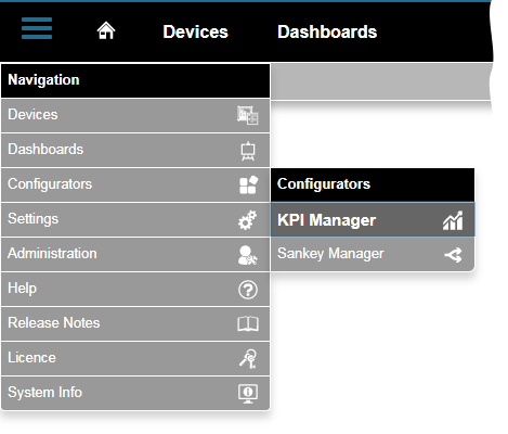
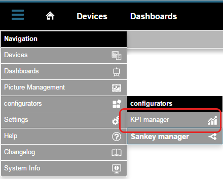
How do I open the KPI function?
- Click in the navigation bar on the "Navigation " button..
- You will find the "KPI Manager" in the drop-down menu under "Configurators".

"KPI Manager" area (overview window):
| Item | Icon | Short text | Description |
|---|---|---|---|
| 1 | Create | Create new key figure (KPI). | |
| 2 | Group | Key figures group (KPI group), can be configured in the KPI Configurator. | |
| 3 | Name | Name of the key figure (KPI).
| |
| 4 | Description | Description of the key figure (can be configured in the KPI Configurator). | |
| 5 | Responsible person | Person responsible for the key figure.
| |
| 6 | Value | Key figure value, depending on the “period” setting.
| |
| 7 | Rating | 3-level rating (traffic light), depending on the key figure and its period.
| |
| 8 | Search | KPI search and filter. | |
| 9 | Open | Open KPI Configurator. | |
| 10 | Copy | Copy KPI | |
| 11 | Delete | Delete KPI. |
The KPI ConfiguratorAnker kpikonfigurator kpikonfigurator
Consists of the areas Settings, KPI rating and trend and Preview. You open the KPI Configurator via item 9 "![]() "of the KPI Manager (refer to "The KPI Manager").
"of the KPI Manager (refer to "The KPI Manager").
The KPI Configurator
- facilitates the formulation and configuration of key figures.
- facilitates rating and trend settings.
- offers a preview of the charts and table set.

Settings
| Item | Icon | Short text | Description |
|---|---|---|---|
| 1 | Formula | Display of the formula selected under item 3a. | |
| 2 | Save | Save input settings. | |
| 3 | Formula | Formula for key figure formation. | |
| 3a | Formula selection list | Selection list of the available formulas:
| |
| 3b | Unit | Optional input field of the unit for labelling the axes of the KPI graph.
| |
| 3c | Colour field | Colour selection for the KPI graph. | |
| 4 | Name | Input field: Name of the key figure (KPI). | |
| 5 | Description | Input field: Description of the key figure (KPI). | |
| 6 | Group | Selection field: Supplementary information on the key figure (KPI). The entry appears in the KPI manager (see item 2 in the description “The KPI Manager”). | |
| 7 | Responsible person | Selection field: Optional input of a responsible person.
| |
| 8 | Selection list: Selected period for which the system forms the key figure (refer also to “The KPI Manager” - item 6 “Value”). Graphs and tables show the evaluation one time period deeper.
| ||
| 9 | Selection list: Selected comparison period, which is compared with the time period selected under item 8. Furthermore, the trend can also pertain to this time period (refer to “Rating and trend”). | ||
| 10 | Operand A | Operand as measured value.
| |
| 10a | Radio buttons: Operand A can be selected as a measured value or constant.
| ||
| 10b | Input field: Designation of operand A.
| ||
| 10c | Colour selection for the graph (bar graph).
| ||
| 10d | Selection field: Selection of the measurement device.
| ||
| 10e | Selection field: Selection of the measured value. | ||
| 11 | Operand B | Operand as constant. | |
| 11a | Radio buttons: Operand B can be selected as a measured value or constant.
| ||
| 11b | Input field: Designation of operand B. | ||
| 11c | Colour selection for the graph (bar graph).
| ||
| 11d | Input field: Numeric input of the constant! | ||
| 12 | “Back” button | Clicking on the button takes you back to the KPI Manager | |
| 13 | “Help” button |
|
Input validation
The system checks - with the input validation - whether all entries have been input correctly in the “Settings” window.
A red warning triangle in the validation column (1st column) denotes empty input fields or incorrect inputs.
![]() Note:
Note:
If you hover over the red warning triangle with the mouse pointer, you obtain a “tool tip” (information) regarding the validation error!
Rating and trendAnker kpibewertung kpibewertung
Key figures can be rated with a 3-stage traffic light. The results are shown in tabular form in the “Preview”.
Key figures are formulated over a time period. The evaluation of the key figures pertains to this time period, or also one time period deeper.
![]() Note:
Note:
The rating of key figures
- takes place as good, neutral or poor.
- takes place in 2 directions, which means you can evaluate a high key figure as good or poor.
- are very clearly visualised with traffic lights. Green traffic lights stand for good key figures here, amber for neutral key figures and red traffic lights for poor key figures
(A neutral traffic light ""- traffic light without colour indicates that the key figures lie outside the defined evaluation range).

| Item | Icon | Short text | Description |
|---|---|---|---|
| 1 | Save | Save input settings. | |
| 2a | Rating level 1 * | Input fields: Enter the range for a “good” rating. | |
| 2b | Rating level 2 | Input fields: Enter the range for a “neutral” rating. | |
| 2c | Rating level 3 * | Input fields: Enter the range for a “poor” rating. | |
| 3 | Trend display |
| |
| 4a | Strongly rising trend ** | Relative input (in %), in relation to the key figure - 4-stage display possible. | |
| Weakly rising trend | |||
| 4b | Strongly falling trend ** | ||
| Weakly falling trend | |||
| 5 | “Back” button | Clicking on the button takes you back to the KPI Manager | |
| 6 | "Help" button |
| |
*... The range values (key figures) for rating level 1 may be greater than the range values for rating level 3 and vice versa. **... Icons indicate the trend. The system recognises the trend due to the range values entered. | |||
The preview function Anker kpivorschau kpivorschau
Clicking on the “Preview” button in the sub-navigation brings up a preview of your KPI graph and the KPI table.
Note: The KPI graph and KPI table can also be placed on dashboards as a widget.
The graphs shows the
- characteristic curve as a line (default setting red).
- operands A and B as a bar.
- operands C and D (if available) also as a line.
| Tipp | ||
|---|---|---|
| ||
A rising or falling key figure (line) provides an indication of the cause of the change due to the bar display. |
The table shows
- the numeric value of the key figure.
- a rating and the trend of the key figure.
| Item | Icon | Short text | Description |
|---|---|---|---|
| 1 | Legend | Shows the colours and names of the key figures and operands. | |
| 2 | Time navigation | Time period navigation for KPI graph and table visualisation. | |
| 3 |
| Rating display | Shows the rating of the selected time period and comparison period |
| 4 | Display of formula | Shows the formula formed with the key figure (see item 3 “The KPI Configurator” - Settings). | |
| 5 | “Back” button | Clicking on the button takes you back to the KPI Manager. | |
| 6 | KPI graph | ||
| 6a | Key figure | ||
| 6b | Operand A | (see item 10 “The KPI Configurator” - Settings). | |
| 6c | Operand B | (see item 11 “The KPI Configurator” - Settings). | |
| 7 | KPI table |
The KPI WidgetAnker kpiwidget kpiwidget
Once created, KPIs can be placed on existing or new dashboards as KPI widgets.
In the “Dashboards” window, your KPI can be
- selected via its name.
- freely positioned on the dashboard as a KPI graph or KPI table and scaled.
![]() Note: It is advantageous and useful to realise visualisation as a KPI chart (KPI graph and table positioned one below the other. See figure “The preview function”).
Note: It is advantageous and useful to realise visualisation as a KPI chart (KPI graph and table positioned one below the other. See figure “The preview function”).

| Item | Icon | Short text | Description |
|---|---|---|---|
| 1 | Select visualisation | Visualisation selection list: Select “Key figure (KPI)” widget! | |
| 2 | Choose a KPI | Selection list of all KPIs. | |
| 3 | View mode | Selection list: KPI graph or KPI table. | |
| 4 | Header | Slide control for showing or hiding the header. |
| Sv translation | |||||||||||||||||||||||||||||||||||||||||||||||||||||||||||||||||||||||||||||||||||||||||||||||||||||||||||||||||||||||||||||||||||||||||||||||||||||||||||||||||||||||||||||||||||||||||||||||||||||||||||||||||||||||||||||||||||||||||||||||||||||||||||||||||||||||||||||||||||||||||||||||||||||||||||||||||||||||||||||||||||||||||||||||||||||||||||||||||||||||||||||||||||||||||||||||||||||||||||||||||||||||||||||||||
|---|---|---|---|---|---|---|---|---|---|---|---|---|---|---|---|---|---|---|---|---|---|---|---|---|---|---|---|---|---|---|---|---|---|---|---|---|---|---|---|---|---|---|---|---|---|---|---|---|---|---|---|---|---|---|---|---|---|---|---|---|---|---|---|---|---|---|---|---|---|---|---|---|---|---|---|---|---|---|---|---|---|---|---|---|---|---|---|---|---|---|---|---|---|---|---|---|---|---|---|---|---|---|---|---|---|---|---|---|---|---|---|---|---|---|---|---|---|---|---|---|---|---|---|---|---|---|---|---|---|---|---|---|---|---|---|---|---|---|---|---|---|---|---|---|---|---|---|---|---|---|---|---|---|---|---|---|---|---|---|---|---|---|---|---|---|---|---|---|---|---|---|---|---|---|---|---|---|---|---|---|---|---|---|---|---|---|---|---|---|---|---|---|---|---|---|---|---|---|---|---|---|---|---|---|---|---|---|---|---|---|---|---|---|---|---|---|---|---|---|---|---|---|---|---|---|---|---|---|---|---|---|---|---|---|---|---|---|---|---|---|---|---|---|---|---|---|---|---|---|---|---|---|---|---|---|---|---|---|---|---|---|---|---|---|---|---|---|---|---|---|---|---|---|---|---|---|---|---|---|---|---|---|---|---|---|---|---|---|---|---|---|---|---|---|---|---|---|---|---|---|---|---|---|---|---|---|---|---|---|---|---|---|---|---|---|---|---|---|---|---|---|---|---|---|---|---|---|---|---|---|---|---|---|---|---|---|---|---|---|---|---|---|---|---|---|---|---|---|---|---|---|---|---|---|---|---|---|---|---|---|---|---|---|---|---|---|---|---|---|---|---|---|---|---|---|---|---|---|---|---|---|---|---|---|---|---|---|---|---|---|---|---|---|---|---|---|---|---|---|---|---|---|---|---|---|---|---|---|---|---|---|---|---|---|---|---|---|
| |||||||||||||||||||||||||||||||||||||||||||||||||||||||||||||||||||||||||||||||||||||||||||||||||||||||||||||||||||||||||||||||||||||||||||||||||||||||||||||||||||||||||||||||||||||||||||||||||||||||||||||||||||||||||||||||||||||||||||||||||||||||||||||||||||||||||||||||||||||||||||||||||||||||||||||||||||||||||||||||||||||||||||||||||||||||||||||||||||||||||||||||||||||||||||||||||||||||||||||||||||||||||||||||||
| |||||||||||||||||||||||||||||||||||||||||||||||||||||||||||||||||||||||||||||||||||||||||||||||||||||||||||||||||||||||||||||||||||||||||||||||||||||||||||||||||||||||||||||||||||||||||||||||||||||||||||||||||||||||||||||||||||||||||||||||||||||||||||||||||||||||||||||||||||||||||||||||||||||||||||||||||||||||||||||||||||||||||||||||||||||||||||||||||||||||||||||||||||||||||||||||||||||||||||||||||||||||||||||||||
| Anker | ||||
|---|---|---|---|---|
|
Con ayuda de medidas puede compararse el consumo y las cifras económicas o números de unidades. Con la función KPI puede crear medidas personalizadas para su empresa y evaluarlas con su propio sistema de evaluación. Pueden emplearse todas las medidas en paneles como widgets KPI. El widget KPI puede visualizarse en formato de gráfica, tabla o combinada en el panel.
La gráfica le ofrece una vista de las medidas y sus operandos. En función de los operandos, usted puede identificar las causas de la mejoría o empeoramiento de las medidas y sus tendencias, en base a las cuales pueden extraerse conclusiones acerca del motivo del cambio y realizar evaluaciones.
Puede crear sus medidas de una manera estructurada y clara con la función de KPI, la cual se compone de los siguientes tres paneles: administrador de KPI, configurador de KPI y widget de KPI.
| Administrador de KPI |
|
| Configurador de KPI | Creación de KPI personalizadas. |
| Widget de KPI | Puede integrarse en paneles. |
Cálculo:
Las medidas siempre se crean para un periodo de tiempo seleccionado. La medida se crea a partir del medio aritmético de una unidad de tiempo.
Ejemplo con el periodo de tiempo «Año pasado»:
| Mes | 1 | 2 | 3 | 4 | 5 | 6 | 7 | 8 | 9 | 10 | 11 | 12 | Meses = 12 |
| Medida | 10 | 10 | 10 | 15 | 15 | 15 | 20 | 20 | 20 | 25 | 25 | 25 | Suma = 210 |
| La medida del año se obtiene a partir de la división de «Suma de medidas» y «Cantidad de meses»: 210 / 12 = 17,5 (medida del año) | |||||||||||||
![]() Nota:
Nota:
Puede configurar parámetros de introducción —como los números de facturación, números de unidades, áreas y números de empleados, entre otros— mediante una introducción manual en la instalación de GridVis Desktop.
¿Cómo abro la función de KPI?
- Haga clic en el botón «Navegación » de la barra de navegación.
- Puede acceder al «Administrador de KPI » desde el menú desplegable en «Configuradores ».
Panel «Administrador de KPI» (ventana de vista general):
| Pos. | Icono | Texto breve | Descripción |
|---|---|---|---|
| 1 | crear | Creación de una nueva medida (KPI). | |
| 2 | Grupo | El grupo de medidas (grupo de KPI) puede configurarse en el configurador de KPI. | |
| 3 | Nombre | Nombre de la medida (KPI).
| |
| 4 | Descripción | Descripción de la medida (puede configurarse en el configurador de KPI). | |
| 5 | Responsable | Responsable de medida.
| |
| 6 | Valor | Valor de medida independiente del ajuste «Periodo de tiempo».
| |
| 7 | Evaluación | Evaluación de tres niveles (semáforo); en función de la medida y su periodo de tiempo.
| |
| 8 | buscar | Búsqueda y filtrado de KPI. | |
| 9 | abrir | Apertura del configurador de KPI. | |
| 10 | copiar | Copiado de KPI | |
| 11 | eliminar | Eliminación de KPI. |
Configurador de KPIAnker kpikonfigurator kpikonfigurator
Se compone de los paneles «Ajustes», «Evaluación y tendencia» y «Vista previa». Puede abrir el configurador de KPI mediante la pos. 9 « ![]() » del administrador de KPI (véase el apartado «Administrador de KPI»).
» del administrador de KPI (véase el apartado «Administrador de KPI»).
El configurador de KPI se caracteriza por los siguientes aspectos:
- sirve para crear y configurar medidas.
- sirve para evaluar y ajustar tendencias.
- ofrece una vista previa mediante gráficas y tablas configuradas.
Ajustes
| Pos. | Icono | Texto breve | Descripción |
|---|---|---|---|
| 1 | Fórmula | Visualización de la fórmula seleccionada en la pos. 3a. | |
| 2 | Guardar | Guardado de los ajustes realizados. | |
| 3 | Fórmula | Fórmula para la creación de medidas | |
| 3a | Lista de selección de fórmulas | Lista de selección de las fórmulas disponibles:
| |
| 3b | Unidad | Campo de entrada opcional de la unidad para etiquetar los ejes de la gráfica de KPI.
| |
| 3c | Campo de color | Selección de color para la gráfica de KPI. | |
| 4 | Nombre | Campo de entrada: nombre de la medida (KPI). | |
| 5 | Descripción | Campo de entrada: descripción de la medida (KPI). | |
| 6 | Grupo | Campo de selección: información adicional sobre la medida (KPI). El elemento aparece en el administrador de KPI (véase la pos. 2 en la descripción del «administrador de KPI | |
| 7 | Responsable | Campo de selección: introducción opcional de un responsable.
| |
| 8 | Periodo de tiempo | Lista de selección: periodo de tiempo seleccionado para el que el sistema crea la medida (véase también «Administrador de KPI»; pos. 6: «Valor»). Las gráficas y tablas muestran la evaluación de una unidad de tiempo con mayor profundidad.
| |
| 9 | Periodo de tiempo para comparación | Lista de selección: periodo de tiempo seleccionado para comparación, el cual se comparará con el periodo de tiempo elegido en la pos. 8. | |
| 10 | Operando A | Operando como valor de medición.
| |
| 10a | Botones de selección: El operando A puede elegirse como valor de medición o constante.
| ||
| 10b | Campo de entrada: denominación del operando A.
| ||
| 10c | Selección de color para la gráfica (gráfica de barras).
| ||
| 10d | Campo de selección: selección del dispositivo de medición.
| ||
| 10e | Campo de selección: selección del valor de medición. | ||
| 11 | Operando B | Operando como constante. | |
| 11a | Botones de selección: el operando B puede elegirse como valor de medición o constante .
| ||
| 11b | Campo de entrada: denominación del operando B. | ||
| 11c | Selección de color para la gráfica (gráfica de barras).
| ||
| 11d | Campo de entrada: ¡introducción numérica de la constante! | ||
| 12 | Botón «Atrás» | Haciendo clic en el botón se vuelve al administrador de KPI. | |
| 13 | Botón «Ayuda» |
|
Validación de entradas
El sistema lleva a cabo la siguiente acción:
Con la validación de entradas verifica si todas las entradas de la ventana «Ajustes» se completaron correctamente.
Un triángulo de advertencia rojo situado en la columna de validación (primera columna) indica campos de entrada vacíos o entradas erróneas.
![]() Nota:
Nota:
¡Si mantiene el ratón encima del triángulo de advertencia rojo, aparecerá información de herramientas acerca del error de validación!
Evaluación y tendenciaAnker kpibewertung kpibewertung
Las medidas pueden evaluarse mediante un semáforo de tres niveles. El resultado correspondiente se visualiza en una tabla de la «vista previa».
Las medidas se crean a lo largo de un periodo de tiempo. La evaluación de las medidas se refiere a dicho periodo de tiempo o a una unidad de tiempo más profunda.
![]() Nota:
Nota:
La evaluación de medidas se caracteriza por los siguientes aspectos:
- el resultado es bueno, neutral o malo.
- se lleva a cabo en dos sentidos, es decir, usted puede evaluar una medida alta como buena o mala.
- puede visualizarse muy bien por medio de semáforos: un semáforo en verde indica unas medidas buenas; en amarillo, unas medidas neutrales; y en rojo, unas medidas malas.
(semáforo neutral «»: un semáforo sin color indica que las medidas se encuentran fuera del rango de evaluación definido).
| Pos. | Icono | Texto breve | Descripción |
|---|---|---|---|
| 1 | Guardar | Guardado de los ajustes realizados. | |
| 2a | Nivel de evaluación 1 * | Campos de entrada: introducción del rango evaluado como «bueno». | |
| 2b | Nivel de evaluación 2 | Campos de entrada: introducción del rango evaluado como «neutral». | |
| 2c | Nivel de evaluación 3 * | Campos de entrada: introducción del rango evaluado como «malo». | |
| 3 | Visualización de tendencias |
| |
| 4a | Tendencia de ascenso pronunciado ** | Entrada relativa (en porcentaje) en relación con el cambio de la medida: es posible una visualización de cuatro niveles. | |
| Tendencia de ascenso suave | |||
| 4b | Tendencia de descenso pronunciado ** | ||
| Tendencia de descenso suave | |||
| 5 | Botón «Atrás» | Haciendo clic en el botón se vuelve al administrador de KPI. | |
| 6 | Botón «Ayuda» |
| |
*... Los valores de rango (medidas) para el nivel de evaluación 1 pueden ser mayores que los valores de rango del nivel de evaluación 3, y viceversa, es decir, usted puede evaluar los valores de rango (medidas) altos como buenos o malos. **... Los iconos muestran la tendencia. El sistema identifica la tendencia mediante los valores de rango introducidos. | |||
Función de vista previaAnker kpivorschau kpivorschau
Haciendo clic en el botón «Vista previa» de la subnavegación, aparecerá una vista previa de su gráfica de KPI y la tabla de KPI.
![]() Nota:
Nota:
La gráfica de KPI y la tabla de KPI también pueden colocarse en paneles como widgets.
La gráfica muestra los siguientes elementos:
- Línea característica como línea (ajuste básico: rojo)
- Operandos A y B representados como barras.
- Operandos C y D (en caso de existir) también representados como línea.
| Tipp |
|---|
Una medida ascendente o descendente (línea) proporciona información sobre la causa del cambio mediante la visualización de barras. |
La tabla muestra los siguientes elementos:
- el valor numérico de la medida.
- una evaluación y la tendencia de la medida
| Pos. | Icono | Texto breve | Descripción |
|---|---|---|---|
| 1 | Leyenda | Muestra colores y denominaciones de las medidas y operandos. | |
| 2 | Navegación de tiempo | Navegación de periodos de tiempo para visualización de gráficas y tablas de KPI. | |
| 3 |
| Visualización de la evaluación | Muestra la evaluación del periodo de tiempo seleccionado y del periodo de tiempo para comparación (véase pos. 2: «Evaluación y tendencia»). |
| 4 | Visualización de fórmula | Muestra las fórmulas creadas con la medida (véase pos. 3: «Configurador de KPI»; ajustes). | |
| 5 | Botón «Atrás» | Haciendo clic en el botón se vuelve al administrador de KPI. | |
| 6 | Gráfica de KPI | ||
| 6a | Medida | ||
| 6b | Operando A | (véase pos.10: «Configurador de KPI»: ajustes). | |
| 6c | Operando B | (véase pos.11: «Configurador de KPI»: ajustes). | |
| 7 | Tabla de KPI |
Widget de KPIAnker kpiwidget kpiwidget
Las KPI creadas pueden colocarse en paneles nuevos o ya existentes como widgets de KPI.
En la ventana «Paneles» puede hacer lo siguiente con su KPI:
- seleccionarla mediante el nombre.
- colocarla libremente en el panel como gráfica de KPI o tabla de KPI, y escalarla. Nota: una visualización como gráfica de KPI resulta ventajoso y útil (gráfica y tabla de KPI colocadas una sobre la otra; véase la imagen de la «función de vista previa»).
| Pos. | Icono | Texto breve | Descripción |
|---|---|---|---|
| 1 | Seleccionar visualización | Lista de selección de la visualización: ¡elegir widget «Medida (KPI)»! | |
| 2 | Elija una KPI | Lista de selección de todas las KPI. | |
| 3 | Modo de visualización | Lista de selección: gráfica de KPI o tabla de KPI. | |
| 4 | Encabezado | Control deslizante para mostrar y ocultar el encabezado. |
| Sv translation | |||||||||||||||||||||||||||||||||||||||||||||||||||||||||||||||||||||||||||||||||||||||||||||||||||||||||||||||||||||||||||||||||||||||||||||||||||||||||||||||||||||||||||||||||||||||||||||||||||||||||||||||||||||||||||||||||||||||||||||||||||||||||||||||||||||||||||||||||||||||||||||||||||||||||||||||||||||||||||||||||||||||||||||||||||||||||||||||||||||||||||||||||||||||||||||||||||||||||||||||||||||||||||||||||
|---|---|---|---|---|---|---|---|---|---|---|---|---|---|---|---|---|---|---|---|---|---|---|---|---|---|---|---|---|---|---|---|---|---|---|---|---|---|---|---|---|---|---|---|---|---|---|---|---|---|---|---|---|---|---|---|---|---|---|---|---|---|---|---|---|---|---|---|---|---|---|---|---|---|---|---|---|---|---|---|---|---|---|---|---|---|---|---|---|---|---|---|---|---|---|---|---|---|---|---|---|---|---|---|---|---|---|---|---|---|---|---|---|---|---|---|---|---|---|---|---|---|---|---|---|---|---|---|---|---|---|---|---|---|---|---|---|---|---|---|---|---|---|---|---|---|---|---|---|---|---|---|---|---|---|---|---|---|---|---|---|---|---|---|---|---|---|---|---|---|---|---|---|---|---|---|---|---|---|---|---|---|---|---|---|---|---|---|---|---|---|---|---|---|---|---|---|---|---|---|---|---|---|---|---|---|---|---|---|---|---|---|---|---|---|---|---|---|---|---|---|---|---|---|---|---|---|---|---|---|---|---|---|---|---|---|---|---|---|---|---|---|---|---|---|---|---|---|---|---|---|---|---|---|---|---|---|---|---|---|---|---|---|---|---|---|---|---|---|---|---|---|---|---|---|---|---|---|---|---|---|---|---|---|---|---|---|---|---|---|---|---|---|---|---|---|---|---|---|---|---|---|---|---|---|---|---|---|---|---|---|---|---|---|---|---|---|---|---|---|---|---|---|---|---|---|---|---|---|---|---|---|---|---|---|---|---|---|---|---|---|---|---|---|---|---|---|---|---|---|---|---|---|---|---|---|---|---|---|---|---|---|---|---|---|---|---|---|---|---|---|---|---|---|---|---|---|---|---|---|---|---|---|---|---|---|---|---|---|---|---|---|---|---|---|---|---|---|---|---|---|---|---|---|---|---|---|---|---|---|---|---|---|---|---|---|---|---|
| |||||||||||||||||||||||||||||||||||||||||||||||||||||||||||||||||||||||||||||||||||||||||||||||||||||||||||||||||||||||||||||||||||||||||||||||||||||||||||||||||||||||||||||||||||||||||||||||||||||||||||||||||||||||||||||||||||||||||||||||||||||||||||||||||||||||||||||||||||||||||||||||||||||||||||||||||||||||||||||||||||||||||||||||||||||||||||||||||||||||||||||||||||||||||||||||||||||||||||||||||||||||||||||||||
| |||||||||||||||||||||||||||||||||||||||||||||||||||||||||||||||||||||||||||||||||||||||||||||||||||||||||||||||||||||||||||||||||||||||||||||||||||||||||||||||||||||||||||||||||||||||||||||||||||||||||||||||||||||||||||||||||||||||||||||||||||||||||||||||||||||||||||||||||||||||||||||||||||||||||||||||||||||||||||||||||||||||||||||||||||||||||||||||||||||||||||||||||||||||||||||||||||||||||||||||||||||||||||||||||
| Anker | ||||
|---|---|---|---|---|
|
Con l’aiuto degli indicatori chiave, i consumi, i numeri economici o le unità di misura vengono resi comparabili. Con la funzione KPI, è possibile creare indicatori chiave personalizzati che possono essere valutati con il proprio sistema. Tutti gli indicatori chiave possono essere utilizzati come widget KPI nelle Dashboard. Il widget KPI può essere visualizzato come grafico, tabella o combinato nella dashboard.
Nel grafico è possibile riepilogare gli indicatori chiave e i relativi operandi. Con l’aiuto degli operandi, è possibile riconoscere le cause del miglioramento o del peggioramento degli indicatori chiave e la loro tendenza, da cui è possibile ricavare le ragioni del cambiamento e fare delle valutazioni.
Con la funzione KPI, composta dalle 3 aree KPI Manager, KPI Configurator e KPI Widget (grafico e tabella), è possibile presentare gli indicatori chiave in modo strutturato e chiaro.
| Manager KPI |
|
| Configuratore KPI | Creazione di indicatori chiave personalizzati. |
| Widget KPI | Può essere integrato nelle Dashboard. |
Calcolo:
Gli indicatori chiave vengono sempre formati per un periodo selezionato. L’indicatore è formato dalla media aritmetica di un’unità di tempo.
Esempio di periodo “anno scorso“:
| Mese | 1 | 2 | 3 | 4 | 5 | 6 | 7 | 8 | 9 | 10 | 11 | 12 | Mesi = 12 |
| Indicatore chiave | 10 | 10 | 10 | 15 | 15 | 15 | 20 | 20 | 20 | 25 | 25 | 25 | Somma = 210 |
| L’indicatore chiave dell’anno risulta dalla divisione di “numero di mesi“ e “somma degli indicatori chiave“: 210 / 12 = 17,5 (Indicatore chiave dell’anno) | |||||||||||||
![]() Nota:
Nota:
Tramite un inserimento manuale nell’installazione GridVis desktop, è possibile configurare parametri come i dati di fatturato, il numero di unità, le aree, il numero di dipendenti e altri ancora.
Come si apre la funzione KPI?
- Fare clic sul pulsante “Navigazione“ nella barra di navigazione .
- Il “Manager KPI “ è raggiungibile dal menu a discesa in “Configuratori “.
Area “Manager KPI“ (finestra riepilogativa):
| Pos. | Icona | Testo breve | Descrizione |
|---|---|---|---|
| 1 | creare | Creare un nuovo indicatore chiave. | |
| 2 | Gruppo | Gruppo di indicatori chiave (gruppo KPI), configurabile nel configuratore KPI. | |
| 3 | Nome | Nome dell’indicatore chiave (KPI).
| |
| 4 | Descrizione | Descrizione dell’indicatore chiave (configurabile nel configuratore KPI). | |
| 5 | Responsabile | Responsabile dell’indicatore chiave.
| |
| 6 | Valore | Valore dell’indicatore chiave, a seconda dell’impostazione “Periodo“.
| |
| 7 | Valutazione | Valutazione a 3 livelli (semaforo), a seconda dell’indicatore e del periodo.
| |
| 8 | cerca | Cercare e filtrare i KPI. | |
| 9 | apri | Aprire il configuratore KPI | |
| 10 | copia | Copiare il KPI | |
| 11 | cancella | Cancellare il KPI. |
Il configuratore KPIAnker kpikonfigurator kpikonfigurator
È costituito dalle aree Impostazioni, Valutazione e andamento e Anteprima. Il configuratore di KPI si apre tramite Pos.9 “ ![]() “ del Manager KPI (vedere “Il Manager KPI“).
“ del Manager KPI (vedere “Il Manager KPI“).
Il configuratore KPI
- viene utilizzato per formare e configurare gli indicatori chiave.
- viene utilizzato per la valutazione e la definizione delle tendenze.
- Offre un’anteprima dei grafici e delle tabelle impostate
Impostazioni
| Pos. | Icona | Testo breve | Descrizione |
|---|---|---|---|
| 1 | Formula | Visualizzazione della formula selezionata nella pos. 3a. | |
| 2 | Salvataggio | Salvare le impostazioni effettuate. | |
| 3 | Formula | Formula per la formazione degli indicatori chiave | |
| 3a | Elenco di selezione delle formule | Elenco di selezione delle formule disponibili:
| |
| 3b | Unità | Campo opzionale dell’unità per l’etichettatura degli assi del grafico dei KPI.
| |
| 3c | Campo colori | Selezione del colore per il grafico KPI. | |
| 4 | Nome | Campo di immissione: Nome dell’indicatore chiave (KPI). | |
| 5 | Descrizione | Campo di immissione: Descrizione dell’indicatore chiave (KPI). | |
| 6 | Gruppo | Campo di selezione: Ulteriori informazioni sull’indicatore chiave (KPI). La voce viene visualizzata nel Manager KPI (vedere il punto 2 della descrizione “Il Manager KPI“). | |
| 7 | Responsabile | Campo di selezione: Inserimento facoltativo di una persona responsabile.
| |
| 8 | Intervallo | Elenco di selezione: Periodo selezionato per il quale il sistema forma l’indicatore chiave (vedere anche “Il manager KPI“ - Pos. 6 “Valore“). I grafici e le tabelle mostrano la valutazione di un’unità di tempo più in profondità.
| |
| 9 | Periodo di comparazione | Elenco di selezione: Periodo di confronto selezionato, che viene confrontato con il periodo selezionato nella Pos. 8. | |
| 10 | Operando A | Operando come lettura.
| |
| 10a | Pulsanti di opzione: L’operando A può essere selezionato come lettura o costante.
| ||
| 10b | Campo di immissione: Denominazione dell’operando A.
| ||
| 10c | Selezione del colore del grafico (grafico a barre).
| ||
| 10d | Campo di selezione: Selezione dello strumento di misura.
| ||
| 10e | Campo di selezione: Selezione della lettura. | ||
| 11 | Operando B | Operando come costante. | |
| 11a | Pulsanti di opzione: L’operando B può essere selezionato come lettura o costante.
| ||
| 11b | Campo di immissione: Denominazione dell’operando B. | ||
| 11c | Selezione del colore del grafico (grafico a barre).
| ||
| 11d | Campo di immissione: Inserimento numerico della costante! | ||
| 12 | Pulsante “Indietro“ | Facendo clic sul pulsante, si torna al Manager KPI. | |
| 13 | Pulsante “Guida“ |
|
Convalida dell’inserimento
Il sistema
Controlla con la convalida dell’inserimento se tutte le voci della finestra “Impostazioni“ sono state inserite correttamente.
Un triangolo di avvertimento rosso nella colonna Convalida (1a colonna) indica campi vuoti o inserimenti errati.
![]() Nota:
Nota:
Se si tiene il mouse sul triangolo rosso di avvertimento, si ottiene un “tooltip“ (informazione) sull’errore di convalida!
Valutazione e andamentoAnker kpibewertung kpibewertung
Gli indicatori chiave possono essere valutati con un semaforo a 3 livelli. Il risultato viene visualizzato sotto forma di tabella nell’“Anteprima“.
Gli indicatori chiave si formano in un periodo di tempo. La valutazione degli indicatori chiave si riferisce a questo periodo o anche a un’unità temporale inferiore.
![]() Nota:
Nota:
La valutazione degli indicatori chiave
- è considerata buona, neutra o scarsa.
- avviene in due direzioni, vale a dire che è possibile valutare un indicatore chiave elevato come buono o scarso.
- può essere visualizzata molto bene con il sistema a semaforo. In questo caso, i semafori verdi indicano indicatori chiave buoni, i semafori gialli indicatori chiave neutri e i semafori rossi indicatori chiave scarsi.
(Un semaforo neutro ““ - Il semaforo senza colore indica che gli indicatori chiave sono al di fuori dell’intervallo di valutazione definito).
| Pos. | Icona | Testo breve | Descrizione |
|---|---|---|---|
| 1 | Salvataggio | Salvare le impostazioni effettuate. | |
| 2a | Livello di valutazione 1 * | Campi di immissione: Inserire l’area classificata come “buona“. | |
| 2b | Livello di valutazione 2 | Campi di immissione: Inserire l’area classificata come “neutra“. | |
| 2c | Livello di valutazione 3 * | Campi di immissione: Inserire l’area classificata come “scarsa“. | |
| 3 | Visualizzazione dell’andamento |
| |
| 4a | Tendenza in forte aumento ** | Inserimento (in %) relativo alla variazione dell’indicatore chiave - È possibile realizzare una visualizzazione a 4 livelli. | |
| Tendenza in leggero aumento ** | |||
| 4b | Tendenza in forte diminuzione ** | ||
| Tendenza in leggera diminuzione ** | |||
| 5 | Pulsante “Indietro“ | Facendo clic sul pulsante, si torna al Manager KPI. | |
| 6 | Pulsante “Guida“ |
| |
*... I valori dell’intervallo (indicatori chiave) per il livello di valutazione 1 possono essere maggiori dei valori dell’intervallo per il livello di valutazione 3 e viceversa. Ciò significa che è possibile valutare i valori di fascia alta (indicatori chiave) in modo positivo o negativo. **... Le icone mostrano la tendenza. Il sistema rileva la tendenza in base ai valori di intervallo inseriti. | |||
La funzione di anteprimaAnker kpivorschau kpivorschau
Facendo clic sul pulsante “Anteprima“ nella sotto-navigazione si visualizza un’anteprima del grafico e della tabella KPI.
![]() Nota:
Nota:
Il grafico KPI e la tabella KPI possono anche essere inseriti come widget nelle Dashboard.
Il grafico mostra la
- curva caratteristica come linea (impostazione di base rossa).
- Gli operandi A e B sono rappresentati da barre.
- Gli operandi C e D (se presenti) sono rappresentati da linee.
| Tipp |
|---|
Un indicatore chiave (linea) crescente o decrescente fornisce informazioni sulla causa della variazione attraverso la visualizzazione a barre. |
La tabella mostra
- il valore numerico dell’indicatore chiave.
- una valutazione e una tendenza degli indicatori chiave
| Pos. | Icona | Testo breve | Descrizione |
|---|---|---|---|
| 1 | Legenda | Mostra i colori e le denominazioni degli indicatori chiave e degli operandi. | |
| 2 | Navigazione nel tempo | Periodo Navigazione per la visualizzazione di grafici e tabelle dei KPI. | |
| 3 |
| Schermata di valutazione | Mostra la valutazione del periodo selezionato e del periodo di comparazione. (cfr. Pos.2 “Valutazione e andamento“). |
| 4 | Schermata della formula | Mostra la formula formata con l’indicatore chiave (cfr. Pos.3 “Configuratore KPI“ - Impostazioni). | |
| 5 | Pulsante “Indietro“ | Facendo clic sul pulsante, si torna al Manager KPI. | |
| 6 | Grafico KPI | ||
| 6a | Indicatore chiave | ||
| 6b | Operando A | (cfr. pos. 10 “Il configuratore KPI“ - Impostazioni). | |
| 6c | Operando B | (cfr. pos 11 “Il configuratore KPI“ - Impostazioni). | |
| 7 | Tabella KPI |
Il widget KPIAnker kpiwidget kpiwidget
I KPI creati possono essere inseriti come widget KPI in dashboard già esistenti o nuove.
Nella finestra “Dasboard“, i KPI
- possono essere selezionati per nome.
- essere posizionati e scalati liberamente sulla dashboard come grafico o tabella KPI.Nota: Una rappresentazione come grafico KPI (grafico e tabella KPI posizionati uno sotto l’altro è vantaggiosa e utile. Cfr. immagine “La funzione di anteprima“).
| Pos. | Icona | Testo breve | Descrizione |
|---|---|---|---|
| 1 | Selezionare la visualizzazione | Elenco di selezione della visualizzazione: Selezionate il widget “Indicatori chiave (KPI)“! | |
| 2 | Scegliere un KPI | Elenco di selezione di tutti i KPI. | |
| 3 | Modalità vista | Elenco di selezione: Grafico KPI o tabella KPI. | |
| 4 | Intestazione | Cursore per mostrare e nascondere l’intestazione. |