
...
| Sv translation | ||||||||||||||||||||||||||||||||||||||||||||||||||||||||||||||||||||||||||||||||||||||||||||||||||||||||||||||||||||||||||||||||||||||||||||||||||||||||||||||||||||||||||||||||||||||||||||||||||||||||||||||||||||||||||||||||||||||||||||||||||||||||||||||||||||||||||||||||||||||||||||||||||||||||||||||||||||||||||||||||||||||||||||||||||||||||||
|---|---|---|---|---|---|---|---|---|---|---|---|---|---|---|---|---|---|---|---|---|---|---|---|---|---|---|---|---|---|---|---|---|---|---|---|---|---|---|---|---|---|---|---|---|---|---|---|---|---|---|---|---|---|---|---|---|---|---|---|---|---|---|---|---|---|---|---|---|---|---|---|---|---|---|---|---|---|---|---|---|---|---|---|---|---|---|---|---|---|---|---|---|---|---|---|---|---|---|---|---|---|---|---|---|---|---|---|---|---|---|---|---|---|---|---|---|---|---|---|---|---|---|---|---|---|---|---|---|---|---|---|---|---|---|---|---|---|---|---|---|---|---|---|---|---|---|---|---|---|---|---|---|---|---|---|---|---|---|---|---|---|---|---|---|---|---|---|---|---|---|---|---|---|---|---|---|---|---|---|---|---|---|---|---|---|---|---|---|---|---|---|---|---|---|---|---|---|---|---|---|---|---|---|---|---|---|---|---|---|---|---|---|---|---|---|---|---|---|---|---|---|---|---|---|---|---|---|---|---|---|---|---|---|---|---|---|---|---|---|---|---|---|---|---|---|---|---|---|---|---|---|---|---|---|---|---|---|---|---|---|---|---|---|---|---|---|---|---|---|---|---|---|---|---|---|---|---|---|---|---|---|---|---|---|---|---|---|---|---|---|---|---|---|---|---|---|---|---|---|---|---|---|---|---|---|---|---|---|---|---|---|---|---|---|---|---|---|---|---|---|---|---|---|---|---|---|---|---|---|---|---|---|---|---|---|---|---|---|---|---|---|---|---|---|---|---|
| ||||||||||||||||||||||||||||||||||||||||||||||||||||||||||||||||||||||||||||||||||||||||||||||||||||||||||||||||||||||||||||||||||||||||||||||||||||||||||||||||||||||||||||||||||||||||||||||||||||||||||||||||||||||||||||||||||||||||||||||||||||||||||||||||||||||||||||||||||||||||||||||||||||||||||||||||||||||||||||||||||||||||||||||||||||||||||
|

| Anker | ||||
|---|---|---|---|---|
|
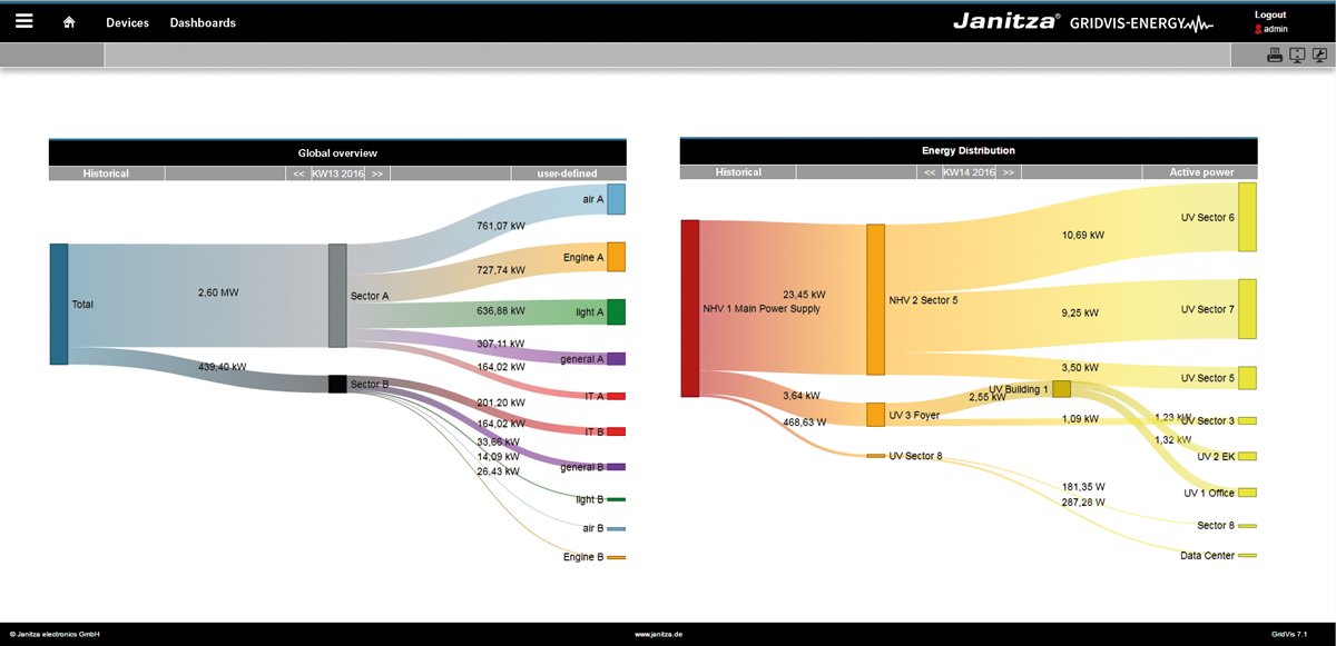
The Sankey diagram
- Visualises energy flows (quantity flows) in graphical form as diagrams.
- Connecting areas show consumption data or other measured values, proportional to the size of the measured value.
- Is simple and intuitive to create with the Sankey Configurator, and manage with the Sankey Manager.
- Can be integrated as a widget into every dashboard and evaluated.
The Sankey function consists of 3 areas:
| 1. | Sankey Manager | Management tool for Sankey diagrams. |
| 2. | Sankey Configurator | Creation of individual Sankey diagrams. |
3. | Sankey Widget | Can be placed on the dashboard. |
The Sankey ManagerAnker sankeymanager sankeymanager
The Sankey Manager is the management tool for Sankey diagrams.
The Sankey Manager
- Manages all Sankey diagrams.
- Offers a structured and informative overview of all existing Sankey diagrams.
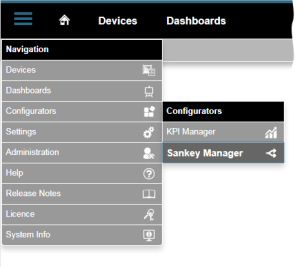
How do I open the Sankey Manager?
- Click in the navigation bar on the "Navigation
 " button.
 - You will find the "Sankey Manager
 " in the drop-down menu under "Configurators
  ".
".
"Sankey Manager" area (overview window):
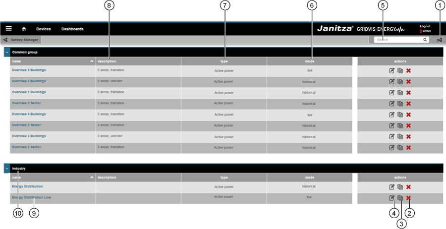
Item | Icon | Short text | Description |
|---|---|---|---|
| 1 | Create | Create new Sankey diagram. | |
| 2 | Delete | Delete Sankey diagram. | |
| 3 | Copy | Copy Sankey diagram. | |
| 4 | Open | Open Sankey Configurator. | |
| 5 | Search and filter | Search and filter Sankey diagrams. | |
| 6 | Mode | Sankey diagram mode. The Sankey diagram shows "live values" or "historical values". | |
| 7 | Type | Type of measured value (e.g. effective power). | |
| 8 | Description | Information text that has been stored with a Sankey diagram. | |
| 9 | Name | Name of the Sankey diagram. Clicking on the name opens a preview. | |
| 10 | Group | Sankey diagram group. Can be configured in the Sankey Configurator. |
The Sankey ConfiguratorAnker sankeykonfigurator sankeykonfigurator
Using the Sankey Configurator, you create your own Sankey diagrams without programming knowledge. In order to create a Sankey diagram, you create nodes and connections in the Sankey Configurator and link these with each other, according to requirement (see also description of "Nodes and links").
The Sankey Configurator
- Consists of 4 areas (settings, nodes, links and preview).
- Facilitates the creation of individual Sankey diagrams without programming knowledge, through the creation and connection of nodes and links.
- Facilitates e.g. the creation of energy flow analyses for your company without extensive time and effort. You can also select and visualise measured values such as current, effective power or harmonics. Measurement devices - e.g. from Janitza - are a prerequisite for energy flow analyses. These must be used at the desired measurement points and linked with the Sankey Configurator.
- Opens for every Sankey diagram by clicking on the button "
 " in the "Actions" area of the Sankey Manager (see "The Sankey Manager" screen under item 4).
Settings
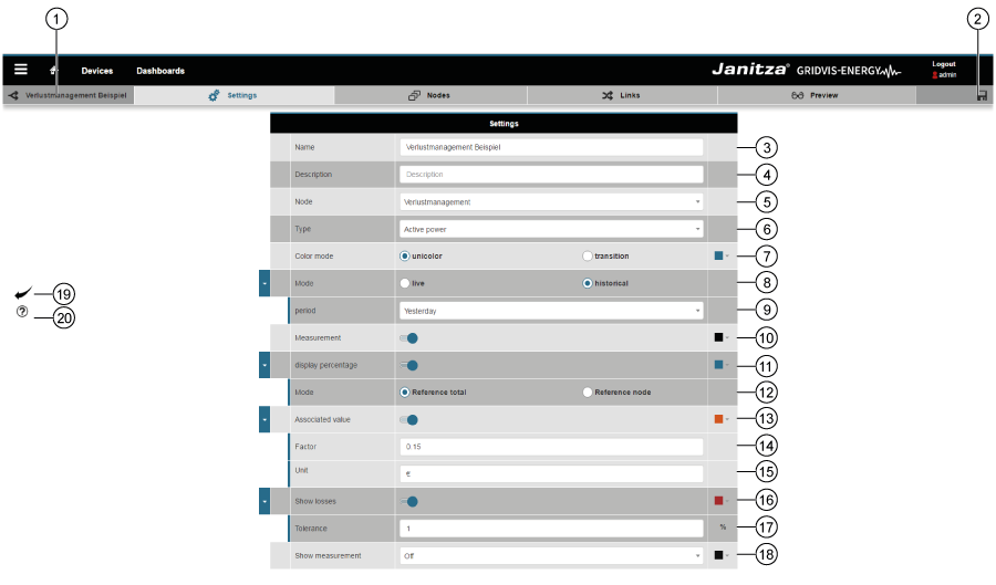
| Item | Icon | Short text | Description |
|---|---|---|---|
| 1 | Name of the Sankey diagram. | ||
| 2 | Save |
| |
| 3 | Name |
| |
| 4 | Description |
| |
| 5 | Group |
| |
| 6 | Type | A precondition for the creation of a Sankey diagram is the selection of the measured value type.
| |
| 7 | Colour mode | Selection of the colour mode for the links:
(Can be set in the “Nodes” area of the Sankey Configurator). | |
| 8 | Time mode | Choose between live or historical values:
| |
| 9 | Time period | The Sankey Configurator requires entry of the period in both modes (live and historical values).
| |
| 10 | Measured value | With activated slide control:
| |
| 11 | Relative value | With activated slide control:
| |
| 12 | Mode | Activated radio button - “Reference total”:
Activated radio button - “Reference node”:
| |
| 13 | Associated value | The associated value shows the measured value, multiplied by a factor and assigned a unit. In this way it is possible to visualise e.g. the “costs” (or similar) in your Sankey diagram links at a glance. With activated slide control:
| |
| 14 | Factor | “Factor” input field:
| |
| 15 | Unit | “Unit” input field:
| |
| 16 | Loss management | With activated slide control:
| |
| 17 | Tolerance | “Tolerance” input field:
| |
| 18 | Show measurement | The “Show measurement” selection list has 4 settings:
| |
| 19 | “Back” button | Clicking on the button takes you back to the Sankey Manager | |
| 20 | “Help” button |
|
Example of “tool tip display”:

In this example, the following slide controls are activated:
- Measured value (in kW)
- Relative value (in %)
- Associated value (in €)
The setting in the “Show measurement” selection list is “Measured value”.
| Info | ||
|---|---|---|
| ||
In the GridVis desktop installation, it is possible to configure virtual devices (VD). With virtual devices, it is possible to add up different measured values. The results can be selected as an independent device. This application is very helpful in order to replace a missing measured value. |
Nodes and links - explanationAnker gruppen_u_verbind gruppen_u_verbind
- A link is an area between two nodes
- A link presents a measured value as an area.
- A node is not a measured value.
- Nodes are groupings or a combination of links (measured values).
- Nodes can exhibit multiple links or just a single link.
- Nodes have input and output links.
- Start nodes only ever have output links.
- Target nodes only ever have input links.

Area | Function | Description |
|---|---|---|
Nodes |
|
|
Links |
|
|
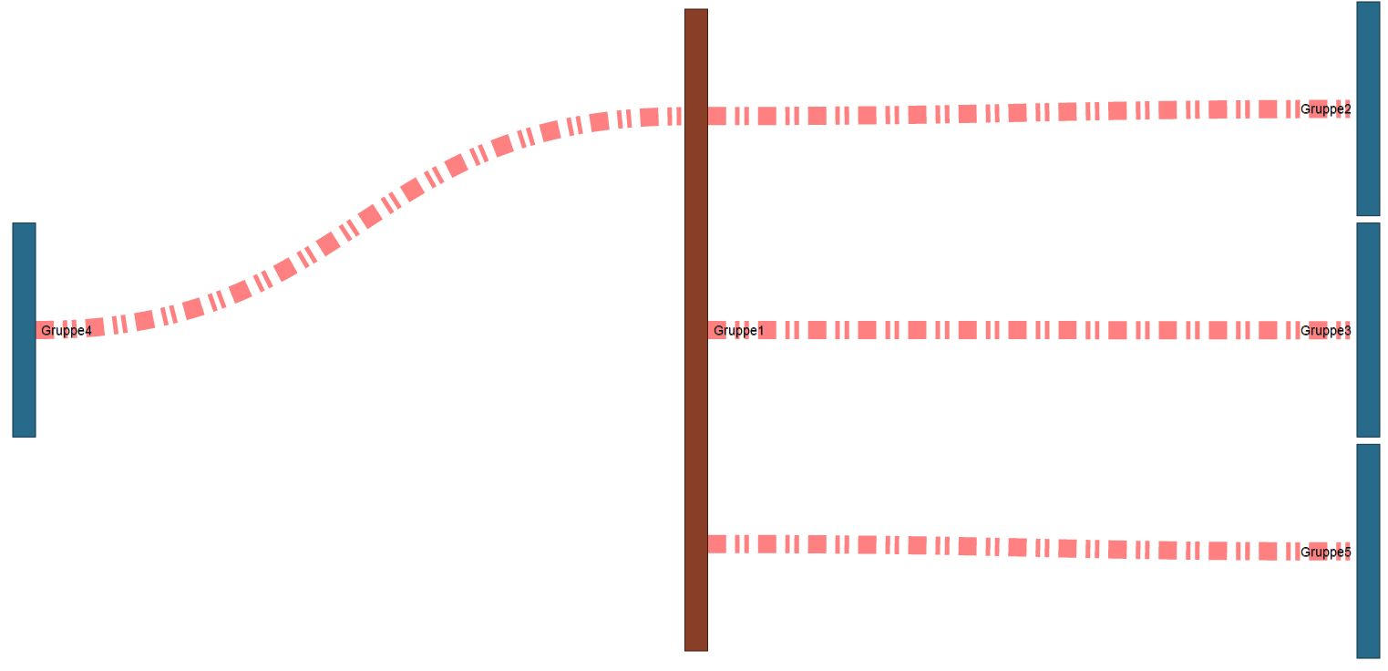
![]() Note:
Note:
If measured values required for the creation of a Sankey diagram are missing (e.g. measured values lie in the future or recordings are missing),
the system plots the measured values (links) for the Sankey diagram with dotted red lines:
| Info | ||
|---|---|---|
| ||
In order to generate complex Sankey diagrams it is important and helpful to link individual nodes, and to display and check the results using the “preview” function! |
Nodes
A node
- is not a measured value!
- constitutes a combination of measured values.
- is required for establishing the link.
The system marks unused nodes. In the “Links” window (sub-navigation > "Links" tab), you link unused nodes and the system removes the marking.
| Info | ||
|---|---|---|
| ||
Structure the nodes created in a clear manner! Use created nodes in links ideally when these are first created. |

| Item | Icon | Short text | Description |
|---|---|---|---|
| 1 | Insert node | Insert new node | |
| 2 |
| Save configuration | Save configuration settings of the node. |
| 3 | Node name |
| |
| 4 | Node colour selection |
| |
| 5 | Start node | Defined node type. The selected node type is displayed in “blue”!
| |
| Node (intermediate node) | ||
| Target node | |||
| 6 | Copy node | Clicking on the button copies the selected node. | |
| 7 |
| Position of the node | Shift created nodes up or down in the configuration window.
|
| |||
| 8 | Delete node |
|
Links
- The area of a link shows the size relationship (of the measured value) in relation to the entire level.
- A link is used to connect two nodes with each other.
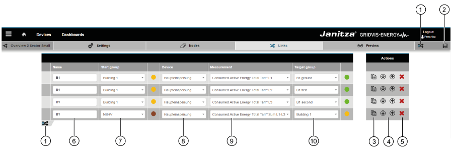
| Item | Icon | Short text | Description |
|---|---|---|---|
| 1 | Insert link | Insert new link. | |
| 2 | Save link | Save configuration settings of the link. | |
| 3 | Copy link | Clicking on the button copies the selected link. | |
| 4 | Position of the link | Shift created links up or down in the configuration window.
This function
| |
| 5 | Delete link |
Deleted links cannot be restored! | |
| 6 | Name of the link | Appears in the Sankey diagram as a tool tip, if the mouse is moved over the link. | |
| 7 | Start node | Shows the node types start and intermediate node.
| |
| 8 | Measuring devices selection |
| |
| 9 | Measured value selection |
| |
| 10 | Target node | Shows the node types target and intermediate node.
|
The preview functionAnker vorschau vorschau
Clicking on the “Preview” button in the sub-navigation provides you with a preview of your Sankey diagram.
Newly created links are directly shown in the “Preview” function for the Sankey diagram.
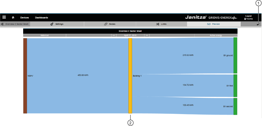
| Item | Icon | Short text | Description |
|---|---|---|---|
| 1 | Back | Go back to the Sankey Manager | |
| 2 | Preview | Preview of the Sankey diagram. |
![]() Note:
Note:
If measured values required for the creation of a Sankey diagram are missing (e.g. measured values lie in the future or recordings are missing),
the system plots the measured values (links) for the Sankey diagram with dotted red lines:
| Tipp | ||
|---|---|---|
| ||
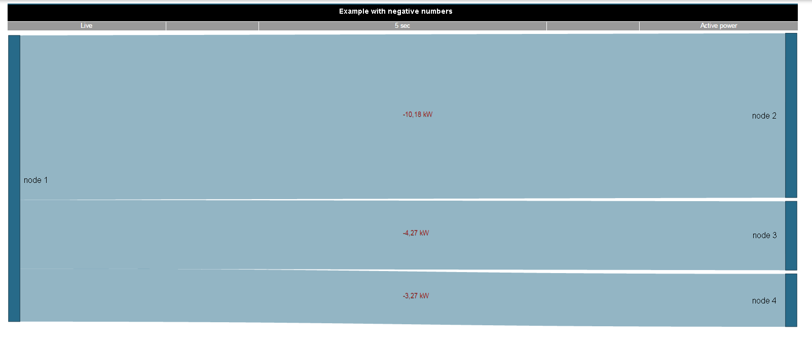
Plot Sankey diagrams that show positive and negative measured values
If your Sankey diagram contains only positive or only negative measured values then the system plots all links in full. A “minus sign” indicates the negative measured values. |
Example 1: Positive and negative measured values in a Sankey diagram.
Example 2: Sankey diagram with exclusively negative measured values.
The Sankey WidgetAnker widget widget
Once created, Sankey diagrams can be placed on existing or new dashboards as widgets.
In the “Dashboards” window, your Sankey diagram can be
- selected via its name.
- freely positioned on the dashboard and scaled.

| Item | Icon | Short text | Description |
|---|---|---|---|
| 1 | Select visualisation | Visualisation selection list: Select "Sankey diagram" widget! | |
| 2 | Choose a Sankey | Selection list with all Sankey diagrams | |
| 3 | Header | Slide control for showing or hiding the header. |
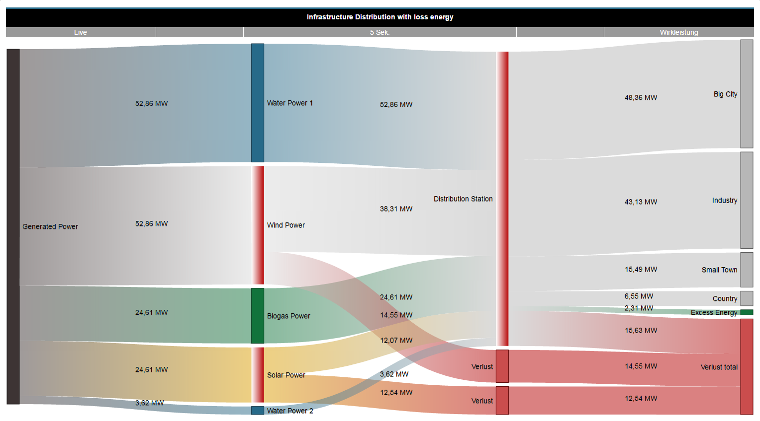
Loss management
The system calculates the loss between the input and output of a node. Inputting a tolerance (relative in %) influences the loss. Deviations from the measured values, which exceed the entered tolerance, are plotted on the Sankey diagram as losses (the affected nodes pulsate):
- You configure the colour of “Losses” via a dialogue field in the “Settings” window (see point 16, table “The Sankey Configurator”)
- The system plots losses as areas, which flow into a loss node.
- A loss target node is a combination of all losses that have arisen.
- With a pulsating node, the colour gradient shows the direction of the loss.
| The loss arises from (loss direction): | Colour gradient of the pulsating node | Comment |
|---|---|---|
Input to output | White to full-tone colour | (see example 1 “Loss at the node output” in the following). |
Output to input | Full-tone colour to white | The system does not plot losses on the input side as areas |
| Tipp | ||
|---|---|---|
| ||
|
Example 1 “Loss at the node output”
Example 2 “Loss at the node input”

...